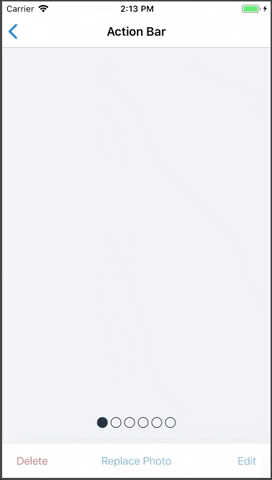
ActionBar
Quick actions bar, each action support Button component props
Supported modifiers: margin, padding.
Read more about modifiers here.
PROPS
| name | description | type | default |
|---|---|---|---|
| height | action bar height | number | 48 |
| backgroundColor | action bar background color | string | Colors.white |
| actions | actions for the action bar | arrayOf | |
| centered | should action be equally centered | bool | |
| useSafeArea | use safe area, in case action bar attached to the bottom (default: true) | bool | true |
| keepRelative | keep the action bar postion relative instead of it absolute position | bool | |
| style | style the action bar | union |
LIVE EXAMPLE
CODE SAMPLE
See example here.