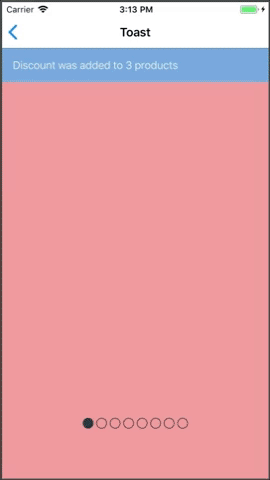
Toast
Extends: Animatable.View
(meaning you can pass the super component's props as well).
(meaning you can pass the super component's props as well).
PROPS
| name | description | type | default |
|---|---|---|---|
| visible | Whether to show or hide the toast | bool | |
| position | The position of the toast. top or bottom | enum | 'top' |
| height | The height of the toast | number | |
| backgroundColor | The background color of the toast | string | |
| color | the toast content color (message, actions labels) | string | Colors.white |
| message | the toast message | string | |
| messageStyle | a custom style for the toast message | union | |
| icon | a left icon | number | |
| actions | one or two actions for the user to display in the toast | arrayOf | |
| onDismiss | callback for dismiss action | func | |
| autoDismiss | number of milliseconds to automatically invoke the onDismiss callback | number | |
| allowDismiss | show dismiss action | bool | |
| onAnimationEnd | callback for end of component animation | func | |
| renderContent | render a custom toast content (better use with StyleSheet.absoluteFillObject to support safe area) | func | |
| centerMessage | should message be centered in the toast | bool | |
| animated | should the toast appear/disappear with animation | bool | true |
| enableBlur | enable blur effect for Toast | bool | |
| blurOptions | blur option for blur effect according to react-native-blur lib (make sure enableBlur is on) | object | |
| zIndex | custom zIndex for toast | number | 100 |
LIVE EXAMPLE
CODE SAMPLE
See example here.