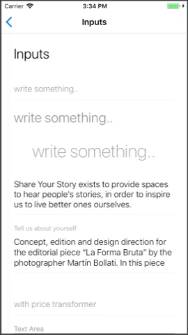
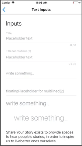
TextField
A wrapper for Text Input component with extra functionality like floating placeholder
Extends: TextInput
(meaning you can pass the super component's props as well).
(meaning you can pass the super component's props as well).
Supported modifiers: Typography.
Read more about modifiers here.
PROPS
| name | description | type | default |
|---|---|---|---|
| floatingPlaceholder | should placeholder have floating behavior | bool | |
| floatingPlaceholderColor | floating placeholder color as a string or object of states, ex. {default: 'black', error: 'red', focus: 'blue'} | union | |
| helperText | This text will appear as a placeholder when the textInput becomes focused, only when passing floatingPlaceholder as well (NOT for expandable textInputs) | string | |
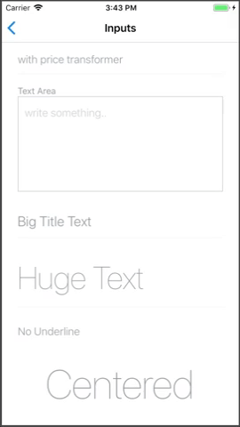
| hideUnderline | hide text input underline, by default false | bool | |
| underlineColor | underline color as a string or object of states, ex. {default: 'black', error: 'red', focus: 'blue'} | union | |
| disabledColor | the color of all text when the input is disabled (if undefined will not apply color) | string | |
| centered | should text input be align to center | bool | |
| error | input error message, should be empty if no error exists | string | |
| enableErrors | should the input component support error messages | bool | true |
| expandable | should the input expand to another text area modal | bool | |
| renderExpandableInput | Render custom expandable input (requires expandable to be true) | func | |
| renderExpandable | allow custom rendering of expandable content when clicking on the input (useful for pickers) accept props and state as params, ex. (props, state) => {...} use toggleExpandableModal(false) method to toggle off the expandable content | func | |
| onToggleExpandableModal | Callback for the modal toggle. Pass with renderExpandable to control the modal toggle | func | |
| topBarProps | The picker modal top bar props | shape | |
| transformer | transform function executed on value and return transformed value | func | |
| title | Fixed title that will displayed above the input (note: floatingPlaceholder MUST be 'false') | string | |
| titleColor | The title's color as a string or object of states, ex. {default: 'black', error: 'red', focus: 'blue'} | union | |
| titleStyle | Additional styles for the title (not including 'color') | union | |
| showCharacterCounter | should the input display a character counter (only when passing 'maxLength') | bool | |
| floatOnFocus | should float the placeholer when focused (instead of when typing) | bool | |
| useTopErrors | should the errors be displayed at the top | bool | |
| rightIconSource | Icon asset source for showing on the right side, appropriate for dropdown icon and such | union | |
| placeholderTextColor | Colors.dark40 |
LIVE EXAMPLE
CODE SAMPLE
See example here.