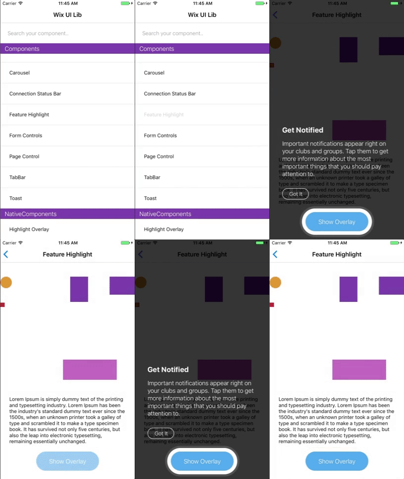
FeatureHighlight
FeatureHighlight component for feature discovery
Extends: HighlighterOverlayView
(meaning you can pass the super component's props as well).
(meaning you can pass the super component's props as well).
NOTES
1) FeatureHighlight component must be a direct child of the root view returned in render().
2) If the element to be highlighted doesn't have a style attribute add 'style={{opacity: 1}}' so the Android OS can detect it.
IMPORTANT: FeatureHighlight uses a native library. You MUST add and link the native library to both iOS and Android projects. For instruction please see here
PROPS
| name | description | type | default |
|---|---|---|---|
| visible | Boolean to determine if to present the feature highlight component | bool | |
| highlightFrame | Frame of the area to highlight {x, y, width, height} | shape | |
| getTarget | Callback that extract the ref of the element to be highlighted | func | |
| title | Title of the content to be displayed | string | |
| message | Message to be displayed | string | |
| titleNumberOfLines | Title's max number of lines | number | |
| messageNumberOfLines | Message's max number of lines | number | |
| confirmButtonProps | Props that will be passed to the dismiss button | object | |
| onBackgroundPress | Callback for the background press | func | |
| overlayColor | Color of the content's background (usually includes alpha for transparency) | string | |
| textColor | Color of the content's text | string | |
| borderColor | Color of the border around the highlighted element | string | |
| borderWidth | Width of the border around the highlighted element | number | |
| minimumRectSize | The minimum size of the highlighted component (Android API 21+, and only when passing a ref in 'getTarget') | shape | {width: 56, height: 56} |
| innerPadding | The padding of the highlight frame around the highlighted element's frame (only when passing ref in 'getTarget') | number | 10 |
LIVE EXAMPLE


CODE SAMPLE
See example here.