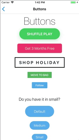
Button
Basic button component
Extends: TouchableOpacity
(meaning you can pass the super component's props as well).
(meaning you can pass the super component's props as well).
Supported modifiers: margin, background.
Read more about modifiers here.
PROPS
| name | description | type | default |
|---|---|---|---|
| label | Text to show inside the button | string | |
| color | The Button text color (inherited from Text component) | string | |
| iconSource | Icon image source | union | |
| iconStyle | Icon image style | union | |
| iconOnRight | Should the icon be right to the label | bool | false |
| backgroundColor | Color of the button background | string | |
| size | Size of the button [large, medium, small] | enum | |
| borderRadius | Custom border radius. | number | |
| onPress | Actions handler | func | |
| disabled | Disable interactions for the component | bool | |
| outline | Button will have outline style | bool | |
| outlineColor | The outline color | string | |
| outlineWidth | The outline width | number | |
| link | Button will look like a link | bool | |
| linkColor | label color for when it's displayed as link | string | |
| labelStyle | Additional styles for label text | union | |
| labelProps | Props that will be passed to the button's Text label. | object | |
| fullWidth | should the button act as a coast to coast button (no border radius) | bool | |
| round | should the button be a round button | bool | |
| enableShadow | Control shadow visibility | bool | |
| avoidInnerPadding | avoid inner button padding | bool | |
| avoidMinWidth | avoid minimum width constraints | bool | |
| getActiveBackgroundColor | callback for getting activeBackgroundColor (e.g. (calculatedBackgroundColor, prop) => {...}) better set using ThemeManager | func | |
| animateLayout | should animate layout change Note: For Android you must set 'setLayoutAnimationEnabledExperimental(true)' via RN's 'UIManager' | bool | |
| animateTo | the direction of the animation ('left' and 'right' will effect the button's own alignment) | enum |
LIVE EXAMPLE
CODE SAMPLE
See example here.