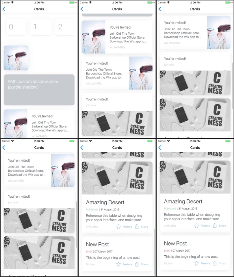
Card
Card component
Extends: TouchableOpacity (Touchable when passing onPress)
(meaning you can pass the super component's props as well).
(meaning you can pass the super component's props as well).
Supported modifiers: margin, padding.
Read more about modifiers here.
PROPS
| name | description | type | default |
|---|---|---|---|
| width | card custom width | union | |
| height | card custom height | union | |
| row | should inner card flow direction be horizontal | bool | |
| borderRadius | card border radius (will be passed to inner Card.Image component) | number | |
| onPress | action for when pressing the card | func | |
| enableShadow | whether the card should have shadow or not | bool | true |
| elevation | elevation value (Android only) | number | |
| enableBlur | enable blur effect (iOS only) | bool | |
| blurOptions | blur option for blur effect according to react-native-blur lib (make sure enableBlur is on) | object | |
| containerStyle | Additional styles for the top container | union |
LIVE EXAMPLE

CODE SAMPLE
See example here.