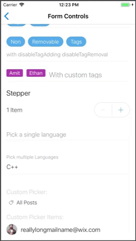
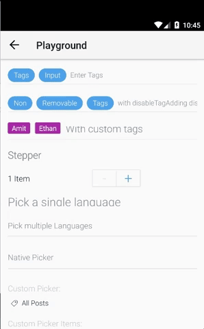
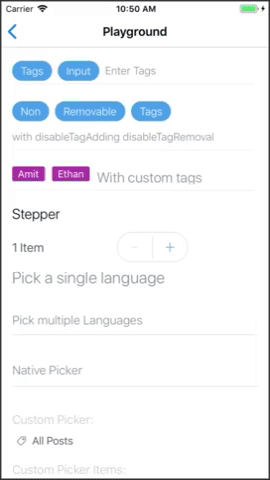
Picker
Picker Component, support single or multiple selection, blurModel and nativePicker
PROPS
| name | description | type | default |
|---|---|---|---|
| value | Picker current value in the shape of {value: ..., label: ...}, for custom shape use 'getItemValue' prop | union | |
| onChange | Callback for when picker value change | func | |
| mode | SINGLE mode or MULTI mode | enum | 'SINGLE' |
| enableModalBlur | Adds blur effect to picker modal (iOS only) | bool | |
| renderPicker | Render custom picker | func | |
| renderItem | Render custom picker item | func | |
| customPickerProps | Custom picker props (when using renderPicker, will apply on the button wrapper) | object | |
| onPress | Add onPress callback for when pressing the picker | func | |
| getItemValue | A function that extract the unique value out of the value prop in case value has a custom structure | func | |
| getLabel | A function that returns the label to show for the selected Picker value | func | |
| topBarProps | The picker modal top bar props | shape | |
| showSearch | Show search input to filter picker items by label | bool | |
| searchStyle | Style object for the search input (only when passing showSearch) | shape | |
| searchPlaceholder | Placeholder text for the search input (only when passing showSearch) | string | |
| onSearchChange | callback for picker modal search input text change (only when passing showSearch) | func | |
| renderCustomSearch | Render custom search input (only when passing showSearch) | func | |
| useNativePicker | Allow to use the native picker solution (different style for iOS and Android) | bool | |
| renderNativePicker | Callback for rendering a custom native picker inside the dialog (relevant to native picker only) | func | |
| listProps | Pass props to the list component that wraps the picker options (allows to control FlatList behavior) | object |
LIVE EXAMPLE
CODE SAMPLE
See example here.