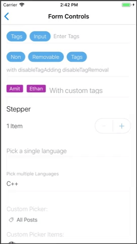
Stepper
Stepper component with increase and decrease buttons
PROPS
| name | description | type | default |
|---|---|---|---|
| label | Text to show next to the current number | string | |
| min | Minimum value | number | |
| max | Maximum value | number | |
| containerStyle | Additional styles for the top container | object | |
| onValueChange | Handler function to receive updates when the value changes | func | |
| initialValue | the initial value | number |
LIVE EXAMPLE
CODE SAMPLE
See example here.