TabBar
Basic TabBar component
PROPS
| name | description | type | default |
|---|---|---|---|
| selectedIndex | current selected tab index | number | 0 |
| style | custom style for the tab bar | custom | |
| indicatorStyle | custom style for the selected indicator | custom | |
| isContentIndicator | whethere the indicator should mark item's content instead of the whole item's width | bool | |
| ignoreLastTab | whethere the indicator should mark the last tab or not (onTabSelected will return tab's index when selected) | bool | |
| disableAnimatedTransition | disable the animated transition of the tab indicator | bool | |
| onChangeIndex | callback for when index has change (will not be called on last tab when passing ignoreLastTab) | func | |
| onTabSelected | callback for when tab selected | func | |
| mode | FIT to force the content to fit to screen, or SCROLL to allow content overflow | enum | 'FIT' |
| useGradientFinish | Add gradiant effect for scroll overflow. IMPORTANT: must have a native module available! | bool | |
| enableShadow | Show Tab Bar bottom shadow (iOS only) | bool | |
| height | 51 |
LIVE EXAMPLE
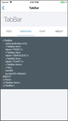
CODE SAMPLE
See example here.